Drawing chromHMM legend with ggplot2
In this blog post, I use ggplot() to plot a legend for chromHMM annotation.
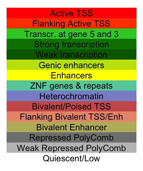
chromHMM uses a Hidden Markov Model to integrate a range of epigenetic markers and predicts the chromatin states, like Transcription Start Sites or enhancers.
The table I use here comes from website: ROADMAP epigenetics project web portal. I copied the table from the website and saved it in a file called “coreChromHMM.txt”. The headers of the table are “STATE.NO.”, “MNEMONIC”, “DESCRIPTION” , “COLOR.NAME” “COLOR.CODE”.
library(tidyverse)

core <- read.table("coreChromHMM.txt",
                   header = T, stringsAsFactors = F, sep = "\t")
Taking a look at the table we see that the colors are coded in RGB format. I use spread() function from tidyverse package to spread the color column into 3 columns, for red, green, and blue respectively. Then I use rgb() function to convert the colors into HEX format.
core <- core %>%
  separate(COLOR.CODE, c("Red", "Green", "Blue"), sep = ",")

hexCol = rgb(core$Red, core$Green, core$Blue, maxColorValue = 255)
names(hexCol) = core$DESCRIPTION
geom_tile() is used to produce the “boxes”, and I use geom_text() to add texts those boxes, or tiles.
ggplot(core, aes(x = 1, y = max(STATE.NO.) - STATE.NO., fill = DESCRIPTION)) +
  geom_tile() +
  geom_text(aes(label = DESCRIPTION), size = 8) +
  scale_fill_manual(values = hexCol) +
  theme_void() +
  theme(legend.position = "none")
The resulting graph looks like this and is readily available to use in a paper manuscript!
Zepeng Mu
Ph.D. Candidate
Ph.D. candidate studying genomics and human diseases at the University of Chicago